
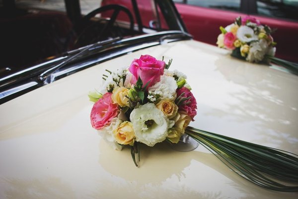
Spring has a way of making even familiar wedding details feel new. Fresh greenery, softer daylight and the first colorful blooms offer plenty of inspiration, but the best spring wedding color palettes do more than copy a garden. They balance the season with your venue, the time of day and the atmosphere you want guests to remember.
Choose Your Colors Around the Spring Setting
Before falling for a collection of swatches, look at what your venue already contributes. A garden with vivid green lawns may need little additional green decor. A ballroom with dark timber and warm lighting might benefit from cream, peach or a stronger floral accent rather than barely visible pastels.
A useful starting point is one main shade, one supporting shade, a smaller accent and a neutral. Let the neutral cover larger surfaces while the accent appears in flowers or stationery. Also consider your wedding date and location: early spring landscapes can look very different from late spring ones, and flower availability varies by region and weather.
Spring Wedding Color Palettes Worth Exploring
Blush Pink, Sage Green and Warm Ivory
This is a gentle, garden-inspired combination that suits outdoor ceremonies and relaxed country venues. Use ivory tablecloths as the foundation, sage in napkins or foliage, and blush in bouquets and smaller arrangements. Choosing a dusty rather than candy-bright pink keeps the look understated. For invitations, try an ivory card with muted green lettering and a blush envelope liner. It is an easy palette to carry from the aisle to the reception without matching every detail exactly.
Lilac, Butter Yellow and Cream
For a playful take on pastel wedding colors, combine cool lilac with soft buttery yellow. Cream prevents the two shades from competing. Picture lilac ribbon around bouquets, pale yellow flowers among white blooms, and cream menus printed with purple headings. This pairing feels particularly fresh at a daytime wedding, where the contrast can be appreciated. Keep large linens neutral and concentrate the color in details guests see up close.
Dusty Blue, Peach and Oyster White
Dusty blue adds a calm, tailored note, while peach keeps the scheme warm and welcoming. This palette works well in a light-filled historic house or an elegant indoor reception. Use blue on stationery, fabric napkins or attendants’ outfits, then bring peach into the flowers. An oyster-white base is softer than brilliant white and helps the colors sit together.
Fresh Green, Lemon and White
Not every spring palette needs pink. Leaf green, pale lemon and clean white can create a crisp, cheerful look for a greenhouse or contemporary venue. White flowers and greenery can provide most of the visual impact, with yellow showing up in selected blooms and place cards. For spring reception decor, simple white vessels and green runners keep the result intentional. Avoid adding multiple unrelated greens; repeat a small family of tones instead.
Coral, Soft Pink and Sand
If you want something brighter, coral gives spring wedding colors an energetic lift. The trick is to use it selectively. Start with sand-colored linens, add soft pink arrangements and reserve coral for statement flowers, table numbers or cocktail-hour details. It makes a lovely choice for a later-spring celebration or a sunlit courtyard. Against a neutral background, even a modest amount of coral feels festive without overwhelming the photographs.
Mauve, Plum and Pale Grey
Spring can still be cool, especially for an evening ceremony. Mauve and a restrained touch of plum offer depth while pale grey keeps the scheme light. Imagine mauve napkins, cream and dusty-purple florals, and plum lettering on invitations. This combination also suits venues with stone walls or silver-toned finishes. Use the deepest shade sparingly so the overall effect remains seasonal rather than heavy.
Make Flowers, Linens and Stationery Work Together
A seasonal wedding palette looks cohesive when colors repeat with purpose, not when every element is identical. Begin with the items that occupy the most visual space: tablecloths, draping, floral installations and the room itself. Once those are settled, use your accent colors in menus, ribbon, candles or place cards. Repeating one shade in two or three different materials creates continuity without making the room look overly coordinated.
Flowers deserve a little flexibility. Ask your florist which varieties and colors are reliably obtainable for your specific date, and be open to substitutions. Tulips, ranunculus and anemones may suit a spring-inspired arrangement, but local growing seasons, imports and individual varieties affect availability and price. A color family such as pale peach is easier to work with than insisting every bloom match a precise digital swatch.
For invitations, prioritize readable contrast. Soft yellow type on white paper may look delicate on a screen but difficult to read in print. Instead, use a deeper version of one palette color for text. If you are still shaping the wider celebration, garden wedding ceremony ideas and wedding invitation color combinations are useful related topics to explore.
A Practical Example: One Palette, Two Different Spaces
Suppose your ceremony is in a green garden at 3 p.m., followed by dinner in a room with warm wooden floors. Choose sage, blush and ivory. Outdoors, let the garden supply the dominant green; add ivory chair ribbons and blush bouquets. Indoors, reverse the balance with ivory tablecloths, sage napkins and pink flowers. The spaces feel connected, yet each works with its own background. This approach can also prevent spending on decorations that simply duplicate the landscape.
Small Checks Before You Commit
View your samples beside the actual bridesmaid fabric, table linen and printed paper; a color name alone tells you surprisingly little. Check the palette in photographs taken in bright light and warm artificial light. If the result feels washed out, deepen one accent rather than adding several new colors. Wedding table centerpiece ideas can offer inspiration for carrying the chosen shades through different table shapes and settings.
Keep the Feeling of Spring, Not Just the Colors
The most appealing spring wedding color palettes leave room for the season to contribute. Natural textures, fresh foliage and thoughtful contrast often matter as much as the shades themselves. Choose a combination you genuinely enjoy, adapt it to your venue, and repeat it where it counts. A few consistent decisions will make the whole celebration feel fresh and considered.
Frequently Asked Questions
What are the best colors for a spring wedding?
Blush, sage, lilac, butter yellow, peach and dusty blue are versatile choices. The best combination depends on your venue, lighting and whether you prefer romantic, modern or vibrant styling.
Can spring wedding colors be bold?
Absolutely. Coral, bright pink and vivid green can feel seasonal when balanced with cream, white or sand. Use stronger colors as accents if you want an airy overall look.
How many colors should a spring wedding palette include?
Three or four coordinated shades are a practical starting point, including a neutral. You can vary their proportions across flowers, linens and stationery rather than using every shade everywhere.
Do wedding flowers have to match the palette exactly?
No. Flowers naturally vary in tone, and subtle differences add dimension. Share a general color direction with your florist and agree on which hues should be emphasized or avoided.